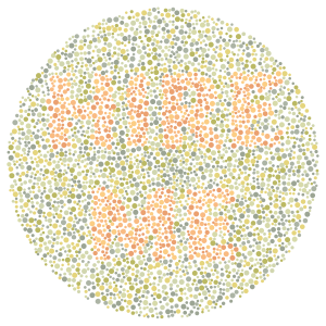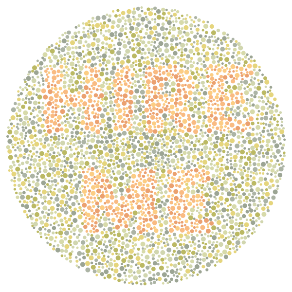
A significant portion of the world’s population has some degree of color vision deficiency, commonly referred to as color blindness. This decreased ability to distinguish colors is much more common in males, with 5-10% of males worldwide facing some difficulty distinguishing colors, most commonly reds and greens. Color blindness is also present in females, although at a rate of less than 1%.
Maps, charts, and video games all use color to communicate information.
As anyone with color blindness can attest, principles of design that may work for most people can fall completely flat. Maps, charts, and video games all use color to communicate information. While clear to most audiences, this data can be difficult or impossible for color blind individuals to effectively comprehend.
Color comes so naturally to most people that color blindness is often neglected by designers. Without the ability to easily see their finished work from the perspective of a colorblind viewer, it is easy for problematic color design to be distributed far and wide.
As a severely colorblind person myself, I have learned to evaluate design aesthetics with an eye towards color blind accessibility. Do you want to include the color blind in your design plans? Contact me today for a quote regarding personalized color blind-friendly design analysis.
